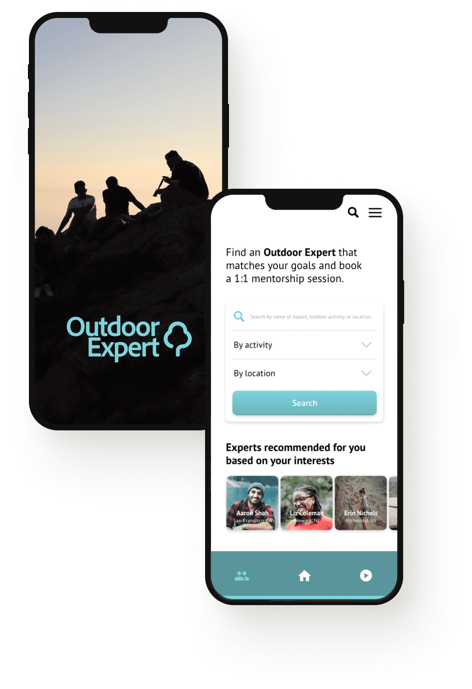
Outdoor Expert: A Mobile App + Responsive Website
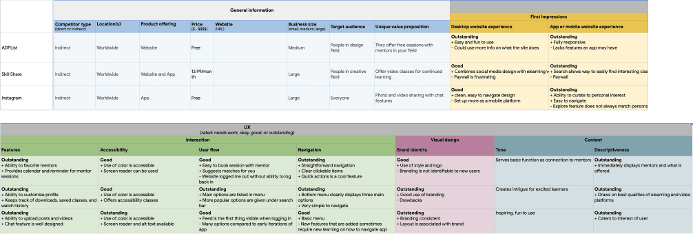
I conceived and developed a project called Outdoor Expert, an online community platform aimed at making outdoor action sports more accessible through expert mentorship. The idea was inspired by my own passion for the outdoors and the recognition that many people lack the guidance needed to engage confidently in outdoor activities.
Project duration
Dec 2021 - Feb 2022
My role
UX designer creating an app and website for Outdoor Expert from conception to delivery
Responsibilities
Conducting interviews, paper and digital wireframing, low and high-fidelity prototyping, conducting usability studies, accounting for accessibility, and iterating on designs
Challenge
Outdoor activities often remain inaccessible to many due to a lack of resources, high costs, and the absence of personalized guidance. Outdoor Expert aimed to bridge this gap by offering remote 1:1 mentorship sessions and supplemental videos from experienced mentors. The challenge was to design an intuitive app and responsive website that would streamline the process of finding and booking mentorship sessions, making outdoor activities more accessible to diverse and historically marginalized groups. This involved understanding user needs, addressing pain points related to accessibility and convenience, and creating a seamless user experience.
Results
The redesign of Outdoor Expert led to significant improvements in user engagement and satisfaction. Task completion rates increased by 20%, with users completing bookings more efficiently and accurately. The average time to book a mentorship session decreased by 42%, reflecting a more intuitive and streamlined process. The final iteration achieved a user satisfaction score of 4.8 out of 5, indicating a greatly improved user experience. These enhancements demonstrated the app's success in making outdoor activities more accessible and enjoyable, effectively addressing the initial challenges.
20%
Increase in task completion rate from first to final user testing
42%
Reduction of time on task from first to final user testing
4.8/5
User satisfaction rating of final iteration
Understanding the user
User Research Summary:
I conducted interviews and created empathy maps to understand users who seek outdoor activity mentorship. I discovered that while target users can find resources, these resources lack 1:1 mentorship and fail to make activities accessible to historically marginalized groups. This can demotivate individuals interested in learning new outdoor skills.
Pain Points:
Accessibility: Many outdoor activities are limited and inaccessible for various groups.
Cost: Resources and equipment are often expensive.
Convenience: The industry lacks digital face-to-face mentorship opportunities.
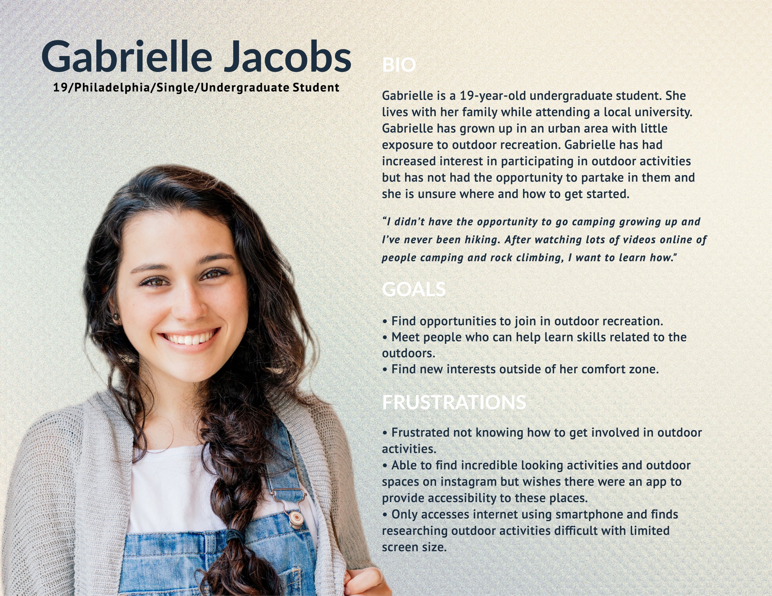
User Persona:
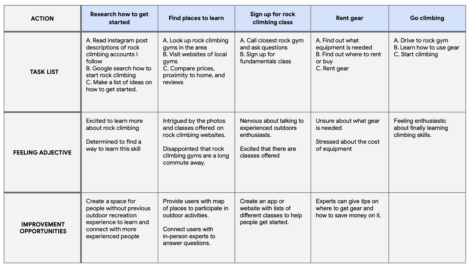
I created a persona and user journey to help empathize with potential users and guide my process based on the problem statement – Gabrielle is an undergraduate student interested in rock climbing who needs an app to connect with knowledgeable climbing enthusiasts because she wants to learn a new skill but does not know where to start.
Digital Wireframes
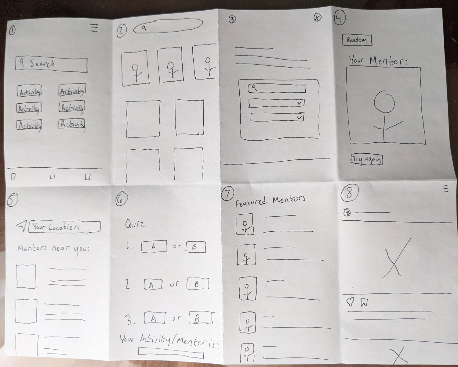
After ideating and drafting paper wireframes, I created the initial digital designs for the Outdoor Expert app. These designs have an overall focus on creating a hub of resources for users interested in learning more about the outdoors. The main feature is intended to showcase profiles of outdoor experts, giving users the ability to select and book a mentorship session.View fullsize
Low-Fidelity Prototype
To create a low-fidelity prototype, I connected all of the screens involved in the primary user flow of choosing and booking a mentoring session with an outdoor expert/mentor. I used several ideas that addressed user pain points such as ensuring that finding an expert and booking a session with them is simple and convenient.
Usability Study
I conducted a moderated usability study with five participants remotely with each study lasting 20-30 minutes. Findings from the study helped guide the designs from wireframes to mockups.
Findings 🕵️♂️:
1. Participants are confused by some of the terminology used in the app, such as “mentor” and “explore.”
2. Participants prefer a different method for finding an outdoor expert instead of continuous scrolling.
3. Participants felt there could be more of an emphasis on the main concept of the app: connecting the user with a knowledgable outdoor expert.
Refining the design
Mockups
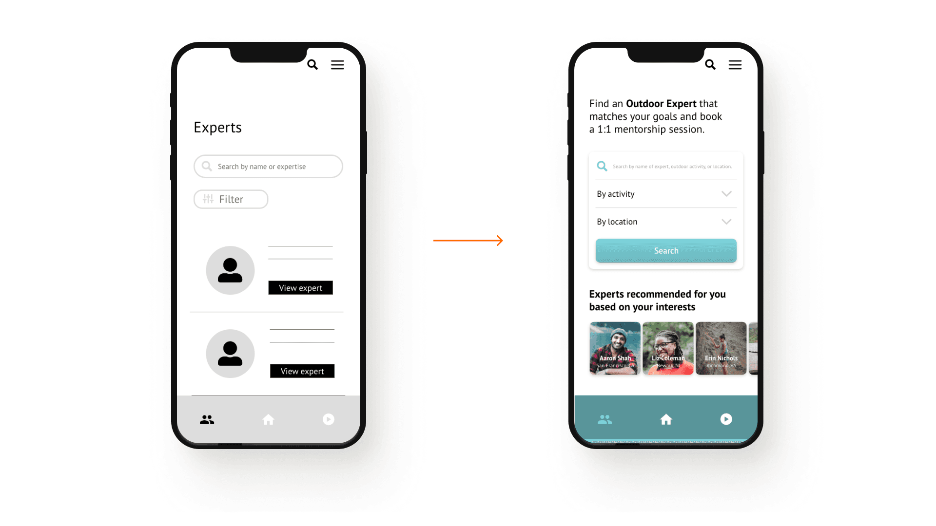
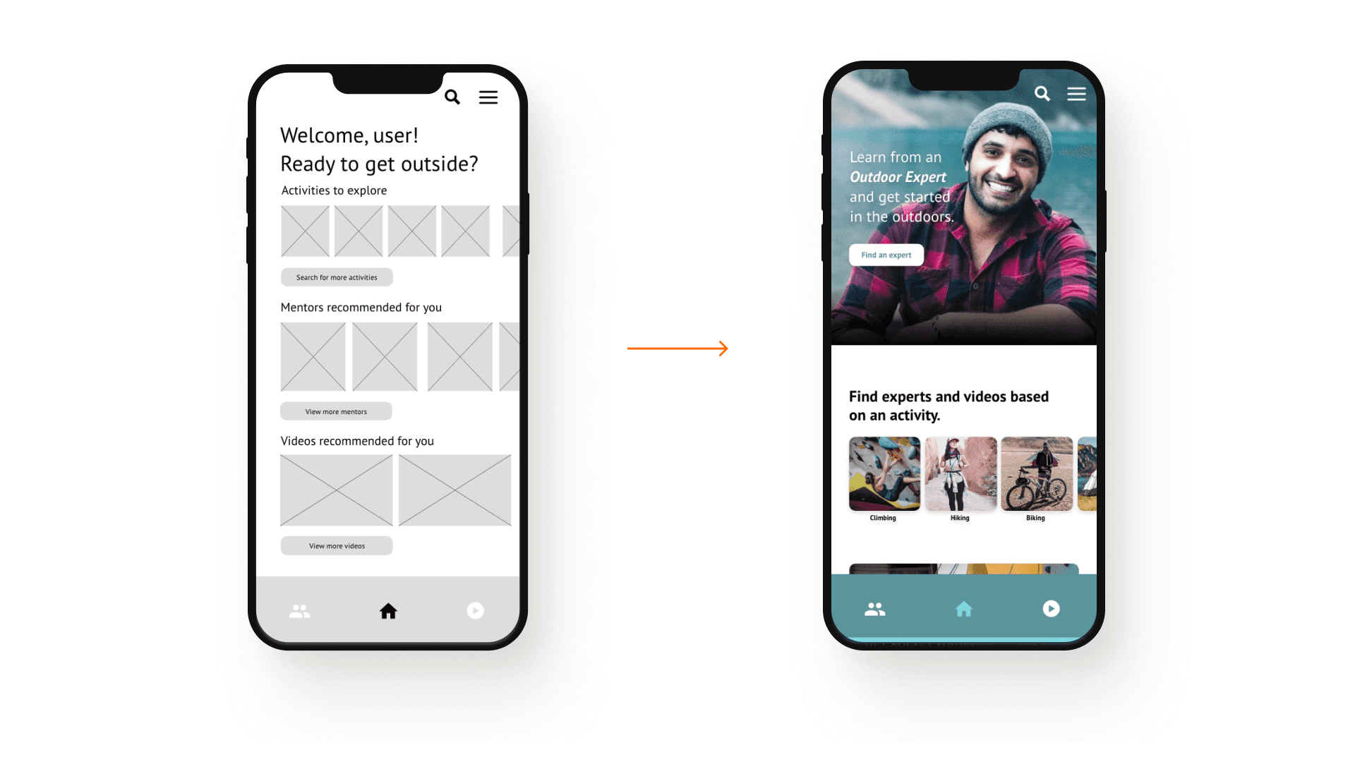
Based on insights developed from the usability study, I made improvements to the designs as they progressed from wireframes to mockups. One significant change was to highlight the main feature of the app: finding an expert to book a 1:1 mentorship session with. In the new iteration, this feature is the focal point. In addition to this, some of the text was altered to help improve users’ understanding, such as changing “mentors” to “experts” and “activities to explore” to “Find experts and videos based on an activity.”
Another screen that underwent changes based on user testing was the expert screen, where users can browse and search for outdoor experts in order to connect and book a mentorship session with them. Instead of a continuous scrolling format like in the wireframes and lo-fi prototype, a more robust search element with dropdown filters was implemented. To inspire browsing without needing to use the search function, a sliding carousel of recommended experts was added.
High-Fidelity Prototype
The final high-fidelity prototype was designed to meet user needs and presents a streamlined flow for choosing an outdoor expert, viewing their profile, checking availability, booking a session, and reviewing a booking.
Accessibility Considerations
Color
Colors of buttons, backgrounds, text, and other elements were tested to make sure they follow web accessibility guidelines.
Responsiveness
The app and website was designed to be easily viewable and functional across different platforms.
Language
Language used to define elements within the app was tested with users in different regions to ensure universal understanding.
Responsive designs
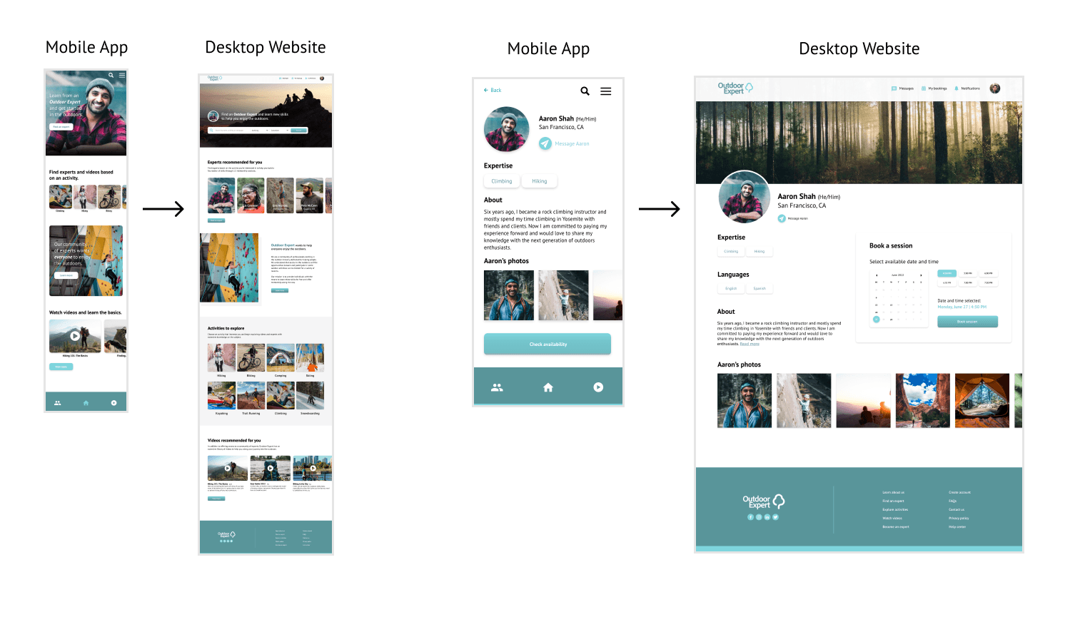
Building off of the mobile designs, I scaled up the platform for improved usability on desktop sized screens.
Accessibility Considerations
Color
Colors of buttons, backgrounds, text, and other elements were tested to make sure they follow web accessibility guidelines.
Responsiveness
The app and website was designed to be easily viewable and functional across different platforms.
Language
Language used to define elements within the app was tested with users in different regions to ensure universal understanding.
“This app provides an easy-to-use avenue to outdoor mentorship… something that would have given me a chance to get into climbing much earlier in my life. I feel like many more people from different backgrounds will have more opportunities to enter the outdoors world through this.”
— Alyssa F. (Usability test participant)
Takeaways
Impact:
Potential users shared that the concept was an exciting and anxiety-reducing idea that may help build confidence and skills within its future users. They found the design to be visually pleasing, easy to navigate, and the primary user flow for booking a mentorship session is simple and intuitive.
What I learned:
While designing the Outdoor Expert app and website I learned that, although it can be difficult to set aside assumptions of what targeted users may desire in a product, it is a necessity to focus on the feedback received in user testing and research. I found it extremely helpful anytime I felt I was getting too wrapped up in the design of the project to take a step back and review insights gained from user research and usability testing. I always came back to the design with a renewed vigor for advocating for the user and confidence in the elements that were created thoughtfully with the user in mind.
Next Steps:
1. Conduct another round of usability studies using the high-fidelity prototype to validate whether the pain points users experienced have been effectively addressed.
2. Ensure that there is a strong representation of potential users, especially people underrepresented in outdoors communities, in the next round of usability tests.
3. Continue to build out the app and website using a similar user-centered design approach.

